
Data resources
|
To understand economic inequality at a local level, it can help to have some data resources to guide your line of inquiry. Luckily, we live at a time when more data is available to the public — including journalists— than ever before. The best part is that you don't even need to have a degree in statistics to utilize this data to inform your reporting: a quick search and skim can tell you plenty. Even basic Excel skills can get you pretty far.
|

|
|
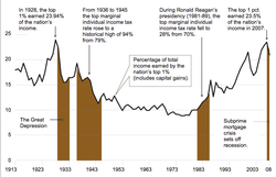
This chart was made by The New York Times to showcase the "Share of the Nation's Income Earned by the Top 1 Percent." Even without The New York Time's resources it is still possible to make charts like this, on a budget. Your news organization can gather all the data by using the U.S. Census Bureau. To create the chart you can use Google Charts to create interactive charts for free.
|
|
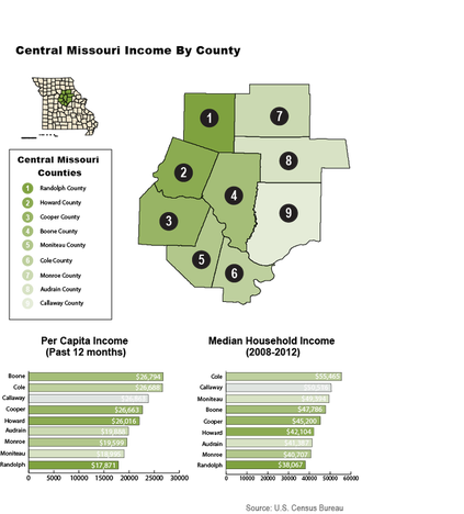
The infographic to the left was made by University of Missouri journalism student Andrew Kreighbaum. Kreighbaum used data from the U.S. Census Bureau. Through the Census Bureau Kreigbaum pulled data for the Per Capita Income and Median Household Income for nine Central Missouri counties.
The infographic itself was made using Adobe Illustrator, a program that your news organization probably already has. Utilize your existing design team to create easy to understand graphics for your readers, even with a tight budget. |
|
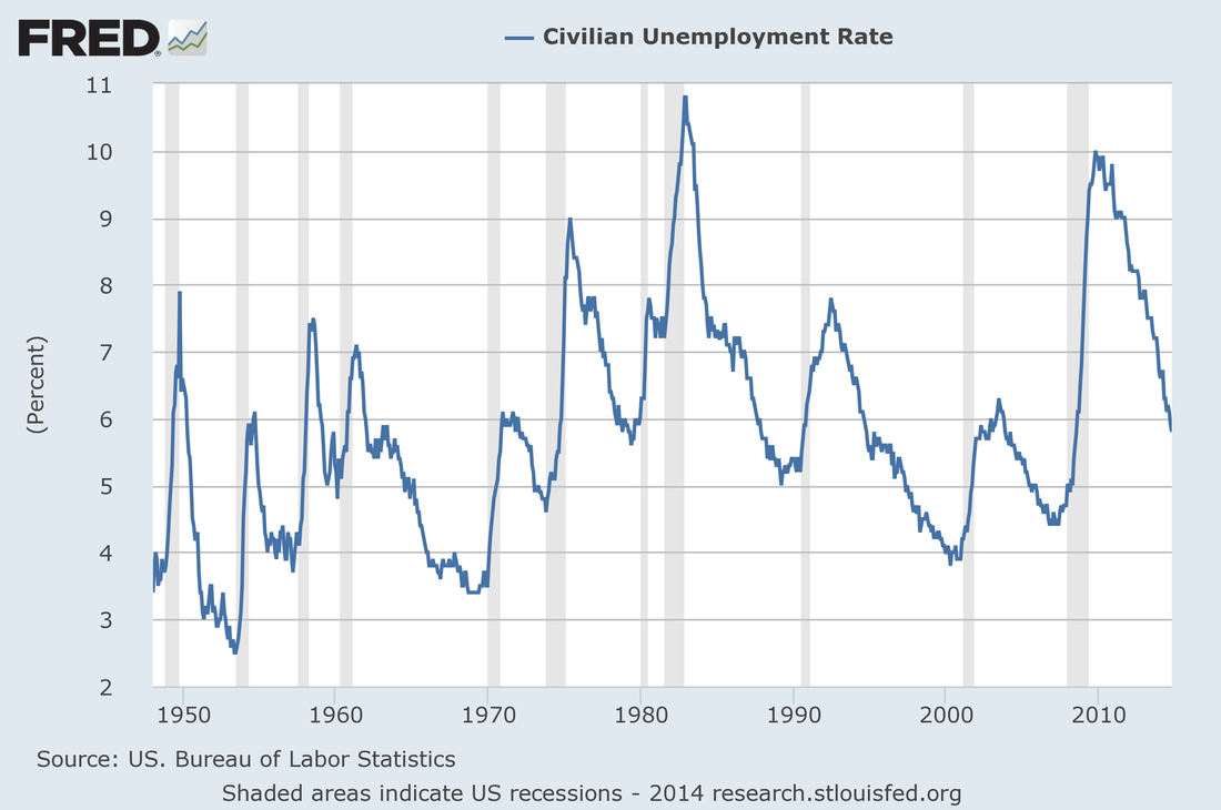
The Federal Reserve Economic Data is a great tool for your organization to become familiar with. The FRED's website not only gives you data but also generates infographics for you.
You are able to customize the chart's options as the site generates those changes, the chart is then exported for your newsrooms use. |
More Resources
The U.S. Census Bureau - It has a specific tab that tracks economic inequality in the United States across time and across ethnic demographics. It also has a data mapper that is easy enough to create embeddable charts to compare a given county to the United States.
FRED - The Federal Reserve of Economic Data collects economic information of nearly any kind, from unemployment to housing purchases in regions as large as the entire United States to an individual town.
American FactFinder - The American FactFinder is a branch of the United States Census Bureau and uses data from the American Community Survey to estimate demographic information in a community. The FactFinder is very navigable and presents its data in tables. It is important to note that these are estimates and not hard numbers, but it's a good starting point to better understand how your community is uniquely affected by economic inequality.
The Internal Revenue Service - Although your taxes might be complicated, the IRS' website is surprisingly user-friendly, and you can access county-specific tax information here.
Living Wage Calculator - Poverty in America created this “Living Wage” calculator for counties and cities throughout the entire United States. This calculator is aimed mostly at the impoverished, but is a helpful tool for a community paper attempting to understand what it takes to survive on limited wages.
The State of Working America - Established by the Economic Policy Institute, the State of Working America includes "a wide variety of data on family incomes, wages, jobs, unemployment, wealth, and poverty that allow for a clear, unbiased understanding of the economy’s effect on the living standards of working Americans."
The State of Working America - Established by the Economic Policy Institute, the State of Working America includes "a wide variety of data on family incomes, wages, jobs, unemployment, wealth, and poverty that allow for a clear, unbiased understanding of the economy’s effect on the living standards of working Americans."
